Professional Organizer Branding That Pops: How Color + Strategy Create Connection
filed under:
Here’s the thing about being a professional organizer: your vibe matters just as much as your systems. You can be the best in the business at labeling, sorting, and color-coding, but if your brand visuals don’t reflect that same level of organization? You’re leaving money (and credibility) on the table.
That’s where Amy from Clutter Care comes in. She doesn’t just tidy up homes—she helps people declutter their digital chaos, streamline processes, and actually breathe again. And when it came time for her to get branding photos, she knew they needed to capture that same calm-meets-clarity energy she brings to her clients every day.
One of our mutual business friends recommended Amy to This Way to Fabulous. Together, we created a professional organizer branding experience that was bright, strategic, and oh-so-Amy—full of Google-inspired colors, efficient setups, and detail shots that tell her story perfectly.
Why Professional Organizer Branding Matters
Let’s be honest: the world doesn’t need another “pretty pantry photo.” What people do need is to feel your expertise—the way your brand communicates calm, trust, and transformation before you ever step foot in their home or email inbox.
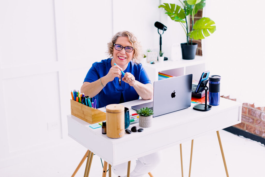
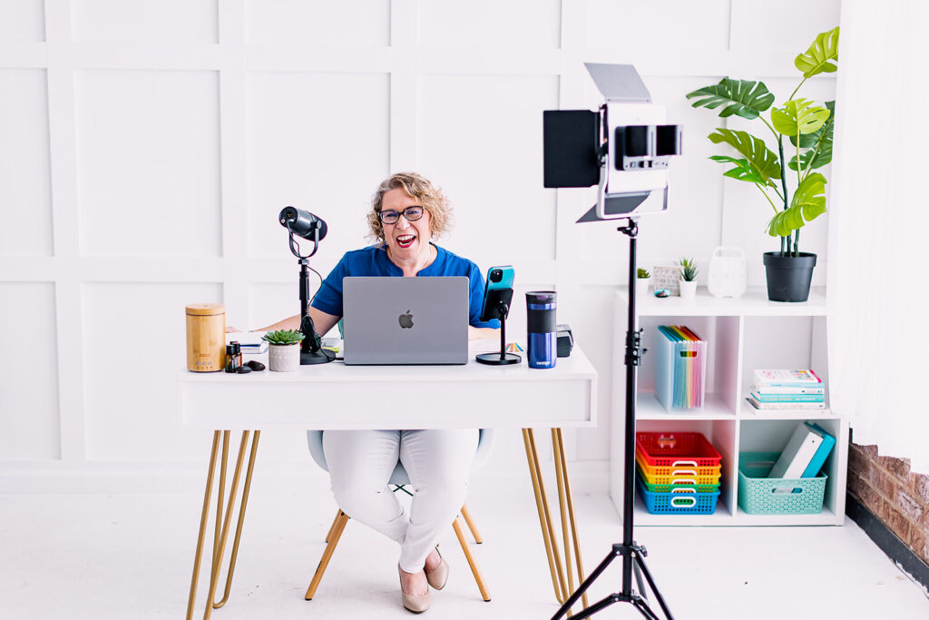
That’s why branding photography for professional organizers is so powerful. It’s not just about showing what you do, it’s about showing what it feels like to work with you. And Amy’s photos do exactly that. From her confident yet warm smile to her playful desk setups, every image says: I’ve got you. Let’s make space for what matters.
Her audience immediately understands she’s not just selling an organized Google workspace—she’s selling clarity. That’s what sets a powerful brand apart from a hobby business.
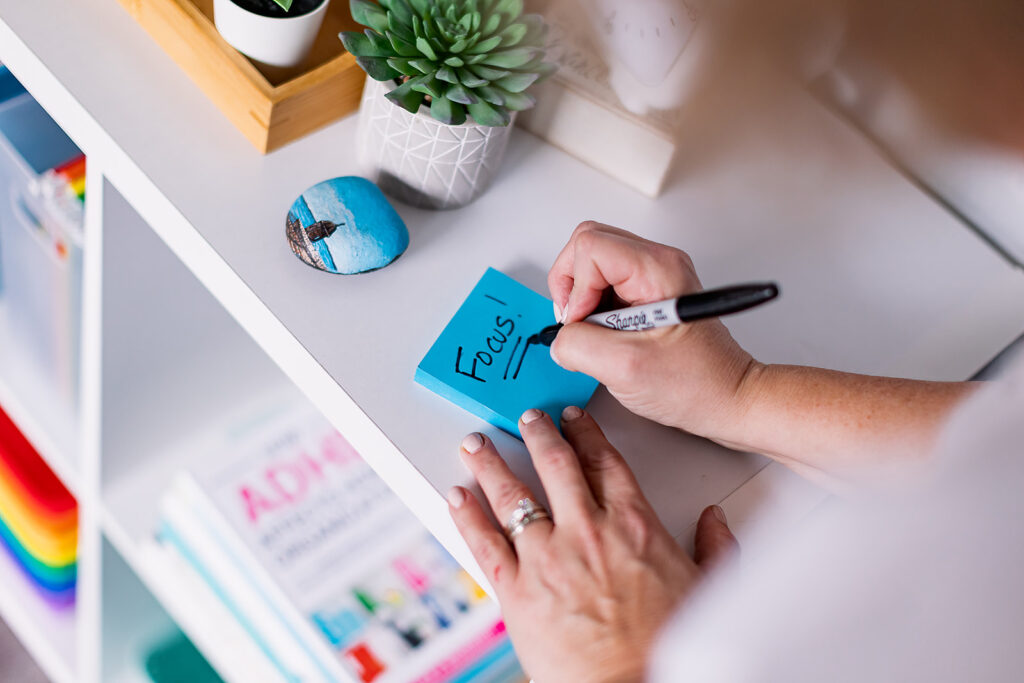
Color That Connects: Google-Inspired Brilliance
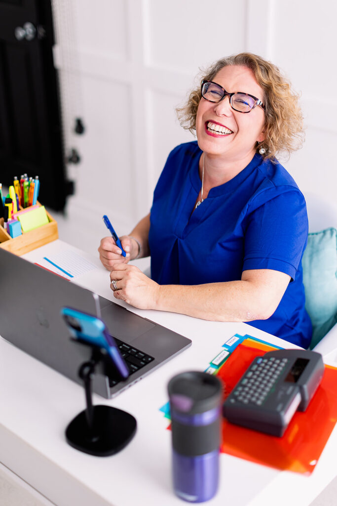
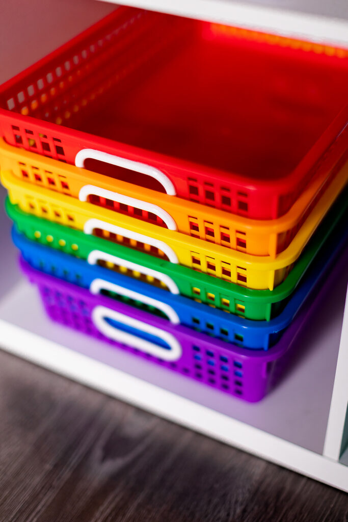
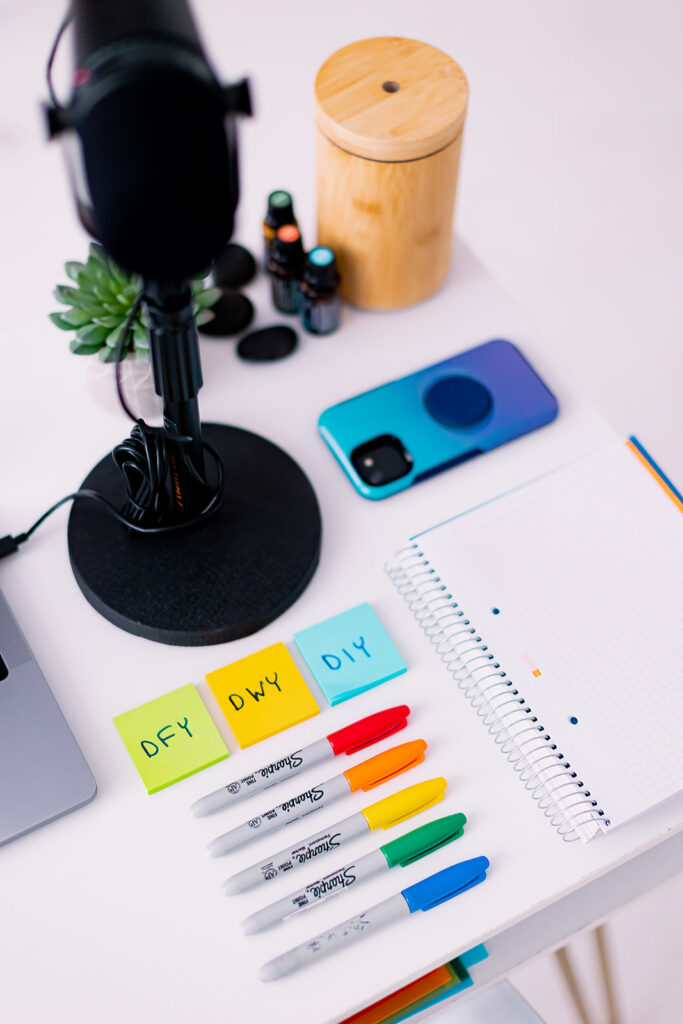
When Amy told me she was a Google Educator, I knew color was going to be a big part of her story. She wanted her visuals to play nicely alongside Google’s iconic palette, which is exactly why you’ll see pops of red, blue, green, and yellow in her brand photos.
We wove those hues throughout her shoot, from color-coded Post-it notes and pens to bins and office supplies that mirror Google’s signature energy. It wasn’t random; it was strategy.
Every vibrant pop of color serves a purpose: reinforcing her expertise in digital organization and creating instant brand recognition.
When your colors are cohesive, your brand becomes instantly recognizable. Whether Amy’s posting on her website, her popular YouTube channel, or LinkedIn, the colors are like a visual handshake—consistent, friendly, and professional.

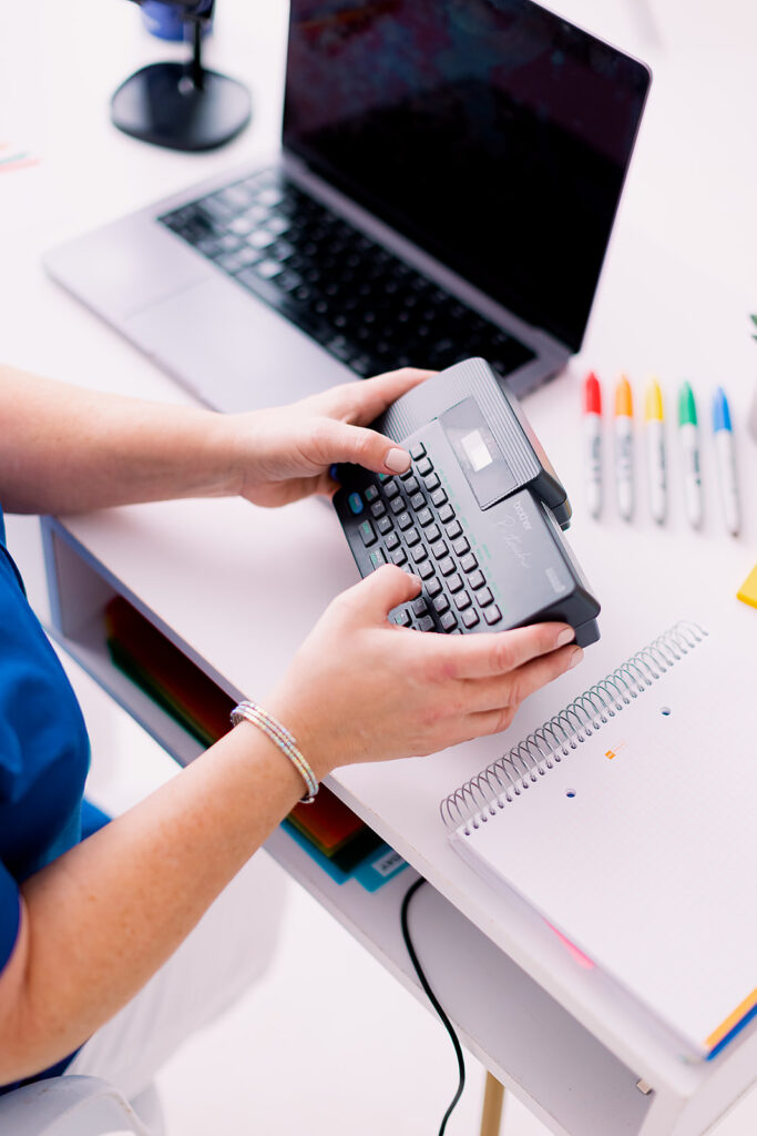
The Power of Detail Images
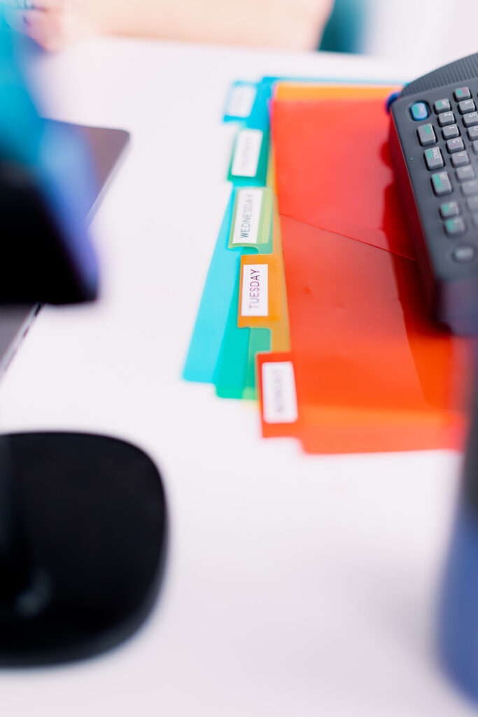
Now, let’s talk about the unsung heroes of every branding shoot: detail images.
You know, those tight, perfectly composed shots of your tools, workspace, or favorite supplies? They’re more than just filler photos—they’re storytelling gold.
(I’ve dedicated an entire blog post to the importance of detail photos that you can read here!)
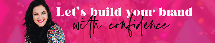
For Amy, detail shots of her laptop, keyboard, colorful office supplies, and desk setups became the foundation of her marketing visuals. These are the photos that make her website feel polished and give her social media posts and YouTube thumbnails variety without needing a new photoshoot every month. They instantly communicate her personality: bright, practical, and organized as hell..

Creating a Branding Content Library That Works Hard
Amy didn’t just walk away from her session with a folder of pretty pictures. She walked away with a visual content library—a strategic mix of headshots, workspace scenes, and product close-ups that she can use across every corner of her brand.
Here’s how she’s using her brand photos now:
- Website Imagery: clean desk setups and close-ups make her site feel fresh, cohesive, and on-brand.
- Social Media Presence: bright pops of color keep her feed consistent and recognizable.
- Google Educator Training: product and process images tie her teaching materials and YouTube thumbnails to her brand identity.
This is the real ROI of branding photography. You’re not paying for a few photos—you’re investing in months (or even years) of versatile, brand-aligned content that keeps your marketing consistent and stress-free.


Professional Organizer Logo Design & Branding Together
We didn’t stop at the photoshoot. I also did a logo refresh for Amy—something that bridged her existing brand identity with her new direction. The result? A clean, professional look that feels modern, approachable, and distinctly her.
When your visuals and logo align, everything clicks.
Her bright color palette now works seamlessly across her digital and physical assets, from her business cards to her Google Slides templates.
That’s what true professional organizer branding looks like: every element designed to make your brand feel cohesive, confident, and recognizable.
Branding that Exudes Order, Clarity & Confidence
At the end of the day, Amy’s photoshoot wasn’t about perfection. It was about alignment. Her brand photos now show exactly what her business stands for: clarity, creativity, and calm confidence.
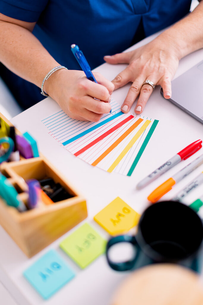
From her cheerful desk shots to her candid laughs mid-organization, everything about her brand feels real. And that’s the point.
Because professional organizing—just like branding—isn’t about making things look good for the sake of it. It’s about creating structure that makes your life (and your business) run better.

Ready to Capture the Details of Your Own Brand Story?
Let’s capture the systems, colors, and moments that make your work uniquely yours.
Contact This Way to Fabulous to plan your next branding photography session. Let’s create a visual library that works as hard as you do—one detail at a time.